Add new InputGroup compound component with Addon, Suffix, and Button support#249
Add new InputGroup compound component with Addon, Suffix, and Button support#249pedromenezes1 wants to merge 22 commits intocloudflare:mainfrom
Conversation
 pedromenezes1
force-pushed
the
feat/input-group-addon
branch
from
pedromenezes1
force-pushed
the
feat/input-group-addon
branch
from
b348d28 to
86e9d5d
Compare
pedromenezes1
changed the title
pedromenezes1
changed the title
pedromenezes1
changed the title
pedromenezes1
force-pushed
the
feat/input-group-addon
branch
17 times, most recently
from
1f88e51 to
ca11f35
Compare
commit: |
pedromenezes1
force-pushed
the
feat/input-group-addon
branch
from
ca11f35 to
5c4d6f2
Compare
Docs PreviewCommit: |
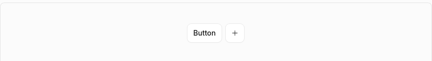
Visual Regression Report17 screenshot(s) with visual changes: Button / Basic183 px (0.18%) changed
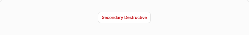
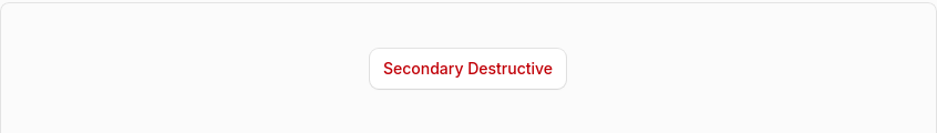
Button / Variant: Secondary Destructive1,122 px (1.11%) changed
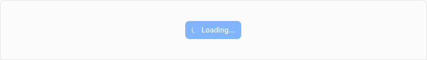
Button / Loading State203 px (0.2%) changed
Dialog / Dialog With Actions191 px (0.19%) changed
Dialog / Dialog Basic192 px (0.19%) changed
Dialog / Dialog Alert354 px (0.35%) changed
Dialog / Dialog Confirmation707 px (0.7%) changed
Dialog / Dialog With Select244 px (0.24%) changed
Dialog / Dialog With Combobox130 px (0.13%) changed
Dialog / Dialog With Dropdown244 px (0.24%) changed
Dialog (Open)0 px (0%) changed
Select / Select With Field633 px (0.54%) changed
Select / Select Custom Rendering412 px (0.41%) changed
Select / Select Loading0 px (0%) changed
Select / Select Multiple801 px (0.79%) changed
Select / Select Complex1,373 px (1.16%) changed
Select (Open)324 px (0%) changed
14 screenshot(s) unchanged
Generated by Kumo Visual Regression |


 mattrothenberg
force-pushed
the
feat/input-group-addon
branch
from
mattrothenberg
force-pushed
the
feat/input-group-addon
branch
from
0caf233 to
5bbecc8
Compare
pedromenezes1
force-pushed
the
feat/input-group-addon
branch
4 times, most recently
from
09d553b to
5917fe8
Compare
…on support

New InputGroup compound component for building inputs with icons, addons, inline suffixes, and action buttons.

Features:
- Field Integration — Accepts label, description, error, required, and labelTooltip props
- Addons — Place icons or text before/after the input using align="start" or align="end"
- Compact Button — Small button inside an Addon for secondary actions
- Action Button — Full-height flush button as a direct child for primary actions
- Inline Suffix — Text that flows seamlessly next to the typed value
- Size Variants — xs, sm, base, lg sizes cascade to all children via context
- Error State — Error flows through context; InputGroup.Input auto-sets aria-invalid
- Disabled State — disabled prop disables all interactive children

Sub-components:
- InputGroup — Root container; provides context and accepts Field props
- InputGroup.Input — Styled input; inherits size, disabled, error from context
- InputGroup.Addon — Container for icons, text, or compact buttons
- InputGroup.Button — Full-height button (direct child) or compact button (inside Addon)
- InputGroup.Suffix — Inline text suffix with automatic width measurement

Includes comprehensive documentation page with demos and unit tests.
…on support

New InputGroup compound component for building inputs with icons, addons, inline suffixes, and action buttons.

Features:
- Field Integration — Accepts label, description, error, required, and labelTooltip props
- Addons — Place icons or text before/after the input using align="start" or align="end"
- Compact Button — Small button inside an Addon for secondary actions
- Action Button — Full-height flush button as a direct child for primary actions
- Inline Suffix — Text that flows seamlessly next to the typed value (uses CSS field-sizing)
- Size Variants — xs, sm, base, lg sizes cascade to all children via context
- Error State — Error flows through context; InputGroup.Input auto-sets aria-invalid
- Disabled State — disabled prop disables all interactive children

Sub-components:
- InputGroup — Root container; provides context and accepts Field props
- InputGroup.Input — Styled input; inherits size, disabled, error from context
- InputGroup.Addon — Container for icons, text, or compact buttons
- InputGroup.Button — Full-height button (direct child) or compact button (inside Addon)
- InputGroup.Suffix — Inline text suffix with CSS-based automatic width sizing

Includes comprehensive documentation page with demos and unit tests.
- Suppress outline on inner input with outline-none!
- Add has-[:focus-visible]:outline-auto to container in grouped mode
- When inner input receives keyboard focus, the native focus ring appears on the entire InputGroup container
- Uses browser's native -webkit-focus-ring-color for consistent appearance
- Fix addon padding with explicit pl-*/pr-* classes (Tailwind JIT compatible)
- Add type="button" to flush Button to prevent form submission
- Add forwardRef to InputGroup.Input for ref forwarding
- Add tests for error state (aria-invalid) and Field integration
- Update component registry with ring-kumo-line color token
- Revert flush button to render inside container (fixes focus ring issues)
- Make addon padding symmetric (start and end now match)
- Add forwardRef to InputGroup.Button for consistency
- Pass disabled state from context to Button
- Add tests for button variant and disabled state
- Fix stale JSDoc comment
- Use ring-0 instead of ring ring-transparent for clarity
- Add data-slot="input-group" for CSS targeting
- Remove overflow-visible rule for buttons (breaks clipping)
- Remove inline ring-transparent (was hiding focus ring)
- Add outline-none to inner input (prevent double outline)
- Let kumo-binding.css handle native outline
Match the docs format change from main (commit adfc9ab)
…zes, fix demo lint errors
- Remove dead has-[[data-slot=input-group-button]] CSS selectors from context.ts
- Add forwardRef to InputGroup.Input, InputGroup.Addon, and InputGroup.Suffix
- Export missing InputGroupButtonProps from barrel index
- Delete accidental empty dist.md from kumo-docs-astro
… element

- Change InputGroup container from <div> to <label>, eliminating ~47 lines
  of imperative JS (useEffect, useRef, useCallback, useId, setTimeout,
  handleMouseDown) in favor of native HTML click-to-focus behavior
- Remove inputId from InputGroup context (no longer needed)
- Remove manual id assignment from InputGroup.Input (label handles focus
  natively, Field's htmlFor handles label association)
- Update InputGroupRootProps to extend ComponentPropsWithoutRef<"label">
- Rewrite test file to match actual demo patterns: remove 2 tests for
  non-existent combinations, update all 31 remaining tests
…adata

Add size and focusMode variants to InputGroup. The focusMode variant
(container | individual) controls whether a single focus ring wraps the
whole group or each interactive child shows its own indicator.

- Populate KUMO_INPUT_GROUP_VARIANTS with size and focusMode definitions
- Scope container focus-ring CSS to data-focus-mode="container"
- Conditionally apply focus styles in InputGroup.Input based on mode
- Add additional props metadata for Input, Addon, Button, Suffix subs
- Support sub-component prop injection in registry codegen
- Add InputGroup.Button PropsTable to docs
…e-colors rule

This fixes a false positive where focus-visible:outline-auto was flagged as an invalid color token. outline-auto is a CSS style value (outline-style: auto), not a color.
pedromenezes1
force-pushed
the
feat/input-group-addon
branch
from
be46320 to
43a1be4
Compare
|
@bonk review this pr |
I think it's /bonk |
![ask-bonk[bot]](https://avatars.githubusercontent.com/in/2454580?s=60&v=4)
There was a problem hiding this comment.
Code Review: InputGroup Compound Component
This is a well-designed and comprehensive addition to the component library. The compound component pattern is cleanly implemented, and the Field integration is a nice ergonomic improvement. The test coverage is thorough and the documentation is excellent.
Summary
Strengths:
- Clean compound component architecture with proper context handling
- Thoughtful Field integration for seamless form building
- Excellent test coverage (531 lines)
- Well-documented with comprehensive demos and MDX page
- CSS-first sizing system with static Tailwind classes (avoiding JIT detection issues)
- Proper a11y handling (
aria-invalidfrom context, tooltip→aria-label derivation)
Issues to address
-
Empty file committed:
packages/kumo-docs-astro/dist.mdis an empty file that appears to have been accidentally committed. Thedist/directory is typically gitignored for build outputs. Please remove this file. -
Changeset update: Per the earlier review comment from @pedromenezes1 - the changeset may need to be updated to reflect the final state of the proposal. Please confirm if the changeset description accurately represents the shipped component API.
Suggestions (non-blocking)
See inline comments for minor code quality suggestions:
input-group-addon.tsx: The string checkchild.type === "button"will never matchinput-group-button.tsx: Thevariant/shapeprops are accepted but always overwritten- Consider adding dev-mode warnings when sub-components are used outside InputGroup context
Overall this is excellent work and ready to merge once the empty file is removed.
| if (!isValidElement(child)) return child; | ||
| const props = child.props as { size?: unknown }; | ||
| if (props.size !== undefined) return child; | ||
| if (child.type === "button" || child.type === Button) return child; |
There was a problem hiding this comment.
The check child.type === "button" will never match since React elements from JSX have the component function as their type, not the string "button".
The child.type === Button check is the one doing the actual work here. Consider simplifying:
| if (child.type === "button" || child.type === Button) return child; | |
| if (child.type === Button) return child; |
| disabled={isDisabled} | ||
| aria-label={tooltipAriaLabel} | ||
| {...props} | ||
| variant="ghost" |
There was a problem hiding this comment.
The variant and shape props are accepted in the type definition (lines 7-9) but are always overwritten here with variant="ghost". This could be confusing for consumers who might try to pass a different variant.
Consider either:
- Removing
variantandshapefromInputGroupButtonPropsentirely - Or documenting that only
ghostis supported
Minor issue - current behavior works correctly.
| } | ||
|
|
||
| export const InputGroupContext = createContext<InputGroupContextValue | null>( | ||
| null, |
There was a problem hiding this comment.
Good use of null as the default context value - this allows detection of sub-components used outside InputGroup.
Consider adding a dev-mode warning when useContext(InputGroupContext) returns null inside sub-components (similar to the accessible name warnings used elsewhere in the codebase). This would help developers catch misuse early.
// In each sub-component:
if (process.env.NODE_ENV === 'development' && !context) {
  console.warn('InputGroup.X must be used within InputGroup');
}|
|
||
| const container = ( | ||
| <InputGroupContext.Provider value={contextValue}> | ||
| <label |
There was a problem hiding this comment.
Clever use of <label> as the container element - clicking anywhere in the InputGroup will focus the input without needing JS event handlers. Nice native behavior.
One consideration: when the InputGroup has no label prop but is wrapped externally by a Field, there could be nested labels. Might be worth documenting this edge case in the component JSDoc.
|
I've submitted a comprehensive code review for PR #249. Here's a summary of my review: Review SummaryOverall assessment: This is a well-designed InputGroup compound component that's ready to merge with a couple minor fixes. Issues to address:
Inline comments provided on:
Strengths highlighted:
|
|
a few things bonk didn't catch:
|
4 participants
New
InputGroupcompound component for building inputs with icons, addons, inline suffixes, and action buttons.Includes comprehensive documentation page with demos and unit tests.
Features
label,description,error,required, andlabelTooltipprops directly; automatically wraps in Field when label is providedalign="start"oralign="end".workers.dev); input width adjusts automatically as user typesxs,sm,base,lgsizes cascade to all children via contextInputGroup.Inputauto-setsaria-invalid="true"when error is presentdisabledprop disables all interactive childrenSub-components
InputGroupInputGroup.Inputsize,disabled,errorfrom contextInputGroup.Addonalign="start"(default) oralign="end"InputGroup.ButtonInputGroup.SuffixUsage Examples
Caveats
InputGroup.Inputomitslabel,description,error,size, andlabelTooltipprops — these are handled by the parentInputGroupInputGroup.Suffix, the input width is measured dynamically via a hidden ghost elementInputGroup.Buttonrenders differently based on placement: full-height flush when direct child, compact when insideAddonScreenshots